


BREAKING: Instagram adds visual refresh to its logo
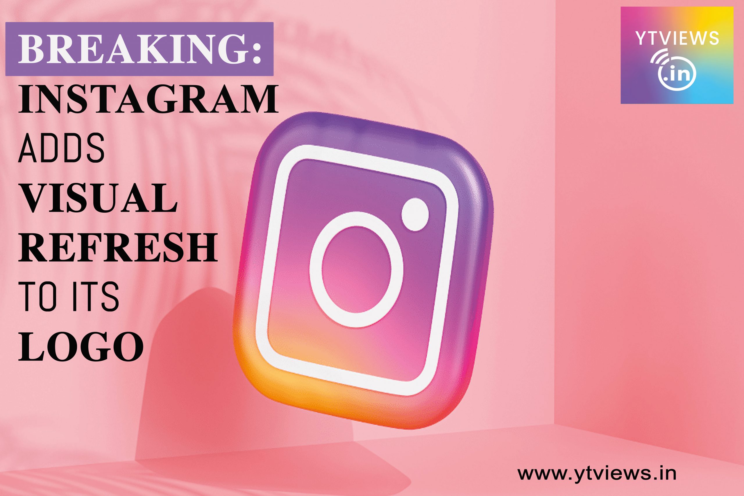 Instagram, a Meta-owned photo-sharing network, has announced the addition of a brighter emblem along with its own typeface in order to offer the app an aesthetic upgrade. According to the corporation, its new design system puts content first, with an emphasis on simplicity and self-expression.
“With a redesigned visual identity, we’re giving our colours, typeface, logo, and other brand aspects new life and meaning. Our new system is built to evolve with us as we work to provide more immersive and inclusive experiences for our community “In a statement, Instagram added.
Instagram’s new typeface
#Instagram just changed its logo pic.twitter.com/pMVcdo2eU5
— Hammod Oh (@ihammod_oh) May 16, 2022
Instagram Sans, the network’s new typeface, was created with heritage in mind and features numerous worldwide scripts, according to the platform. “A unique 3D modelling approach was used to rethink our colourful gradient, making it feel lighted and alive.” The Instagram gradient is the cornerstone of our entire colour system, as it is made up of our brand colours.
“The gradient in our marketing, branding, and even in-app, as seen in Create mode, stickers, and Instagram Story rings, symbolises moments of discovery through illumination.” “Through the intensity of our reinvented gradient, we are delighted to lend life to the Instagram experience,” it continued. Instagram Sans is a new way for the global Instagram community to express themselves in areas like Stories and Reels.
Overall, it’s unlikely to make a significant difference to normal users, but it will allow Instagram to develop more universal experiences and reach people from all over the world. In that regard, whether you or I agree with the ‘new energy and purpose’ of the company logo or not, it’s an excellent change. In conclusion, Instagram’s visual style will be slightly different, which will make it easier to reach people in other areas. In practise, though, the app will remain unchanged.
Related Posts


YouTube Live Streaming Promotion: Complete Guide

LinkedIn New Creator Monetization Plans Explained