


Why Colors Matter More Than You Think on Instagram
Most people don’t stop scrolling because of captions. They stop because something feels right. Or calm. Or different. That reaction comes first. Before reading. Before thinking. On Instagram, color quietly decides whether a post even gets noticed.
Bright Colors Get Attention Quickly
Red, orange, yellow these colors don’t wait. They pull the eye instantly. That’s useful for announcements, launches, or bold opinions. But when everything is bright, nothing stands out. Too much emotions can feel tiring. Bright colors work great when they appear once in a while, not constantly.
Soft Colors Make People Stay
Pastels and muted tones feel unchallenging to look at. They don’t rush the viewer. They feel familiar and personal. That’s why lifestyle, wellness, and everyday storytelling often use softer shades. People scroll slower when content feels gentle, even if they don’t consciously notice it.
Cool Colors Feel Reliable
Blues and greens don’t roar, they are considered to be subtle. They sit quietly in the background. These colors are often linked with clarity and trust. When content is educational or informative, cool tones make it feel more dedicated. The message feels more believable, less forced.
Neutral Colors Keep Things Simple
Black, white, beige, and grey remove distraction. They don’t compete for attention. Minimal feeds often feel premium for this reason. Neutral colors allow the idea to lead, not the design. Everything feels more intentional.
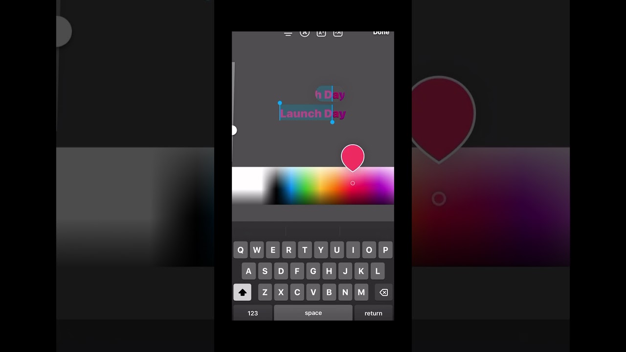
Consistency Matters More Than the Color Itself
One mistake many creators make is changing colors every week. That creates confusion. When colors shift constantly, people don’t recognise the content. Consistency builds familiarity. Using a similar palette again and again helps posts feel connected, even when the topics change. Over time, people start recognising your content without reading the name.

Conclusion
On Instagram, color is part of the message. Always has been. Whether planned or accidental, every post sends a signal before a single word is read. When color matches emotion, content feels natural. When it doesn’t, people move on without thinking twice.