


How Pinterest 2026 Colors Can Boost Engagement
On social media, color decides whether someone pauses for half a second or keeps scrolling. Pinterest’s 2026 color predictions matter because they are not guesses. They are based on what users are already searching, saving, and responding to. That means these colors are already working on people, emotionally and visually, whether brands use them or not.
Why Color Consistency Makes Accounts Look Trustworthy
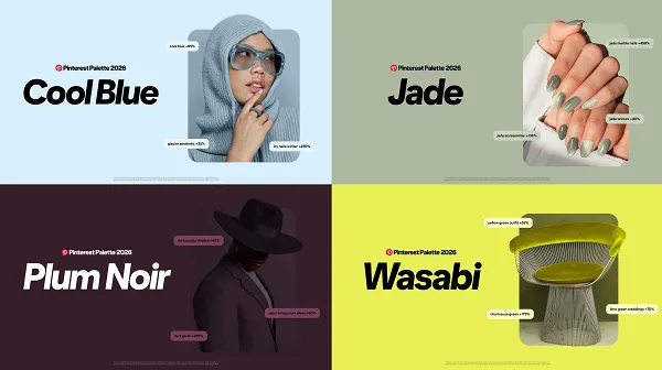
An account with random colors feels chaotic. A page with controlled, repeated tones feels intentional. That alone increases trust. Cool Blue and Jade are especially effective here. They bring calm and clarity, making content easier to consume. When posts feel easy on the eyes, people stay longer—and time spent is a quiet driver of visibility.
Using Dark and Bold Shades Without Overdoing It
Plum Noir works when you want depth. It gives weight to your content, especially for educational or professional pages. It’s not playful, and that’s the point. It signals seriousness.
Wasabi and Persimmon do the opposite—they inject energy. These shades should not dominate your feed, but when used for hooks, announcements, or call-to-action text, they pull attention immediately.
Aesthetic Is Not Decoration, It’s Strategy
A good aesthetic isn’t about being “pretty.” It’s about guiding the viewer’s eyes. Accent colors help highlight key messages. Repeating tones across reels, thumbnails, and carousels builds recognition. Over time, people start recognizing your content without reading the username—and that’s when real brand recall begins.
How the Right Colors Quietly Increase Saves and Shares
How the Right Colors Quietly Increase Saves and Shares
People rarely save a post because they consciously decide to. They save it because it feels useful or feels right. Color plays a silent role here. When your palette is easy on the eyes and emotionally consistent, your content feels less disposable. Cool tones make information feel clearer. Deep tones make it feel valuable. Bright accents make it feel urgent. This balance encourages people to come back later, which is exactly why saves and shares increase—not because the post begged for it, but because it earned it visually.
Conclusion: Good Design Doesn’t Chase Attention, It Holds It
Most accounts struggle not because their ideas are weak, but because their presentation is forgettable. Color is one of the few tools that works before logic kicks in. Pinterest’s 2026 palette highlights what people are already drawn to—calm mixed with confidence, and boldness used with control. When you apply these tones with intention, your page feels clearer, more reliable, and easier to trust. And when content feels trustworthy, people don’t just watch it—they stay, save it, and come back for more.
Related Posts

Increase Your LinkedIn Reach with Ytviews LinkedIn Share Service

The Content Engine That Truly Turns Views Into Real Growth

Pinterest in India: What It Is and Which Creators Use It

How Are Memes Influencing Modern Communication?

Cross Platform Posting: Dominate Social Media in 2025